According to Pantone, Vivid Magenta represents “reveling in pure joy,” “encourages experimentation and self expression without restraint,” “welcomes anyone and everyone with the same verve for life and rebellious spirit. It is a color that is audacious, full of wit and inclusive of all,” and finally, “whose exuberance promotes a joyous and optimistic celebration.” All of these are qualities that I try to bring out in Bespoke & Beloved couples’ weddings. Here are some great ways to use this pinky-red color in your wedding design.
Using Veri Peri - the 2022 Pantone Color of the Year - In Your Wedding
According to Pantone, Veri Peri promises “to bring joy as the 'happiest and warmest of all the blue hues,” and who doesn’t want that at their wedding? I actually like this color, as I haven’t seen too much of it here in Pittsburgh, but it can be a hard color to use in a wedding. Here are some great ways to use this unique periwinkle color in your wedding design, whether you want it as the main color or as an accent pop.
Using the Pantone's Illuminating and Ultimate Gray in Your Wedding
In a move that is so totally 2020, Pantone bucked tradition by naming not one, but two colors of the year for 2021 — Ultimate Gray and Illuminating. At first glance, these colors seem a little faded and lack-luster, especially after the rich, saturated pops of Classic Blue and Living Coral, but I am really excited about these two colors because they are so incredibly versatile!
How to Use Pantone 2020 Color of the Year Classic Blue in Your Wedding
This year, Pantone selected Classic Blue as its Color of the Year, calling it timeless, enduring, reassuring, thought provoking, restful, reflective, and elegant in its simplicity. Here are some ideas for incorporating Classic Blue into your wedding.
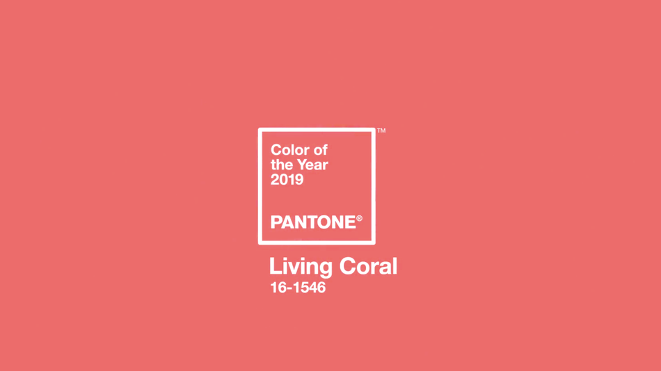
Pantone 2019 Color of the Year: Living Coral
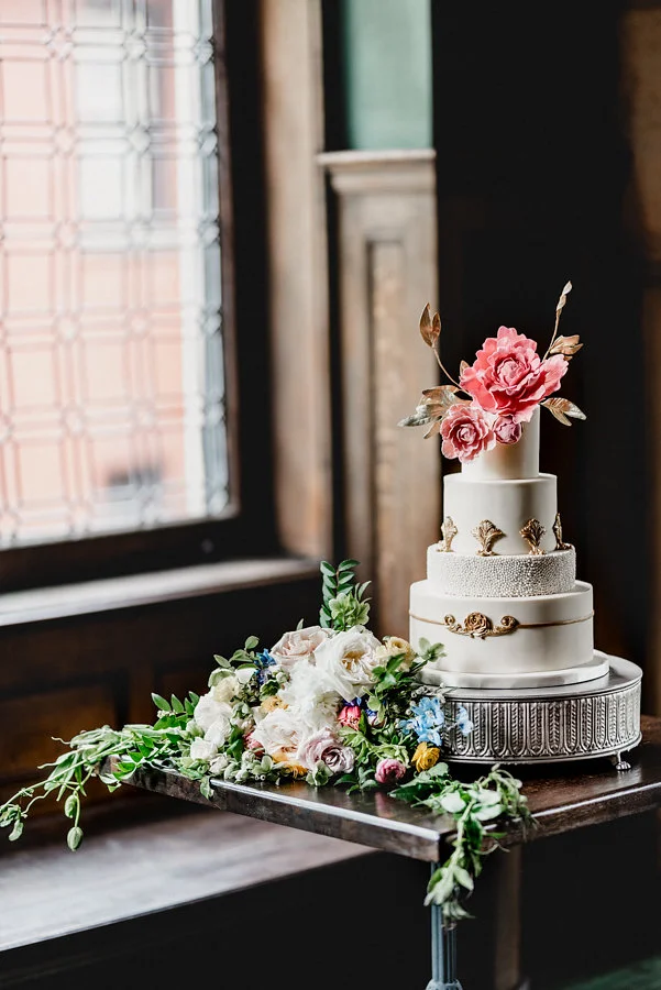
Pantone announced its 2019 Color of the year this week, as it does every December, and the wedding industry is buzzing about the selection. I think the key to using Living Color in up-coming weddings is going to be to use it strategically as an accent color with other statement colors that keep it from falling too far into the overdone and cliched realm.


