

Using the Pantone’s Illuminating and Ultimate Gray in Your Wedding
In a move that is so totally 2020, Pantone bucked tradition by naming not one, but two colors of the year for 2021 — Ultimate Gray and Illuminating. This is only the second time in 22 years of predicting (ahem…selecting seems more accurate to me) colors that Pantone has chosen two colors for one year (the other was 2016, which was more of a gradient than two separate colors).
“The selection of two independent colors highlight how different elements come together to express a message of strength and hopefulness that is both enduring and uplifting, conveying the idea that it’s not about one color or one person, it’s about more than one.
We need to feel encouraged and uplifted, this is essential to the human spirit.”

Alone, Illuminating represents the power of the warm sun — bright and cheerful, sparkling and vivacious, while Ultimate Gray brings the solid, dependable, everlasting elements of a firm, natural foundation — composure, steadiness, and resilience.
But the folks at Pantone encourage us to consider the two colors in solidarity, as a pair.
Together, they highlight our “innate need to be seen, to be visible, to be recognized, to have our voices heard.”

“Two extremely independent colors highlight how different elements come together to express this message of strength and hopefulness”
Other things Pantone says the two colors represent are:
a spirited and emboldening message of happiness supported by fortitude
aspiration and hope, a feeling that everything is going to get brighter
energy, clarity, and hope overcoming uncertainty
insight, innovation, and intuition
experience, respect for wisdom, and intelligence inspiring regeneration and new ways of thinking
quiet reassurance and resilience, optimism about a better tomorrow
Practical and rock solid but at the same time warming and optimistic
At first glance, these colors seem a little faded and lack-luster, especially after the rich, saturated pops of Classic Blue and Living Coral. And it’s unusual for me because I usually am more drawn to those richer jewel tones, but I am really excited about these two colors because they are so incredibly versatile!
So, how do you use them in a wedding you ask? Well, I have all kinds of ideas!
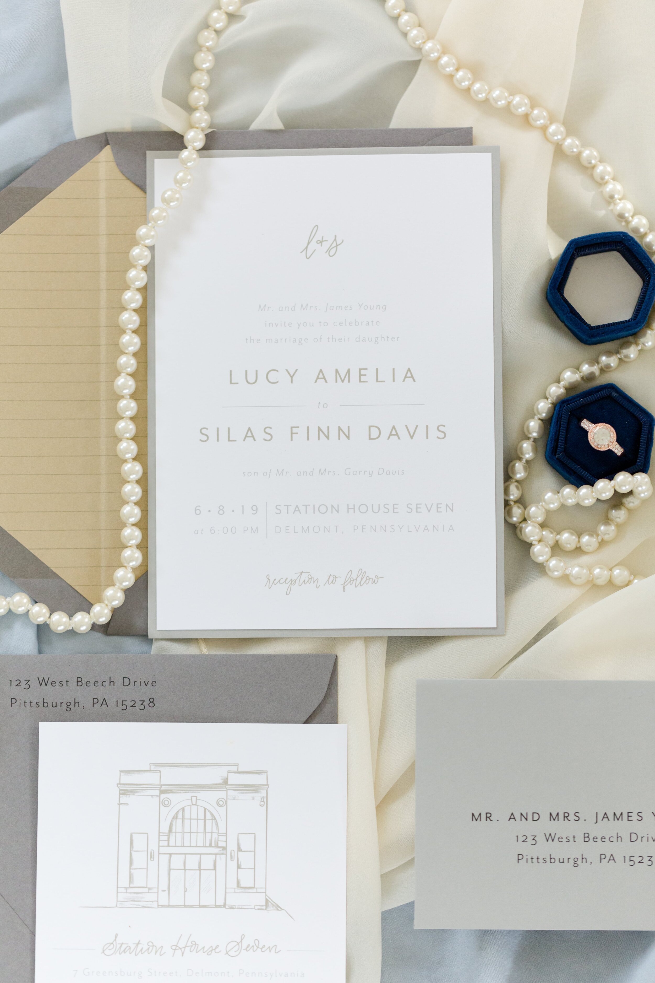
To me, gray is the ultimate neutral — it will go with anything.
Purple, mauve, greens, blues, peaches; brights, pastels, jewel tones, other neutrals — no matter what you pair Ultimate Gray with, it will look stunning.


Workshops by KMP Desert Elopement
Laura Erxleben (Photography and Calligraphy)


Whether you use it as a a main color or an accent, or even in an ombre, it is sure to look wonderful however you use it. The obvious places are clothes (even the wedding dress!) or stationery, but it also makes a great detail pop. It can even show up in your flowers, as sometimes pampas grass or eucalyptus or even some colors of flowers can read as gray depending on what you pair them with.


The Fine Art Wedding Workshop, Belle Epoque Heirloom Wedding
Jenn Marie Photography, Posy, Mosaic (Linen), Jeanie Rae Studio (Stationery)


The Fine Art Wedding Workshop Swan Lake Wedding Boudior


But the thing I like best about this specific color gray is the opportunity to use it to bring texture to your wedding design landscape. Matte silver, mercury glass, metallic silver, matte gray tiles, velvet ring boxes, rustic barn wood, industrial concrete, marble, silky ribbon, weathered driftwood, antique pewter, even the wax of a colored taper or votive, all of these not only add that Ultimate Gray touch to your event, but they add texture. And texture will add depth and personality to everything.


The Fine Art Wedding Workshop, Belle Epoque Heirloom Wedding


Workshops by KMP Desert Elopement
Kait Mace (Photography), Laura Erxleben (Calligraphy)


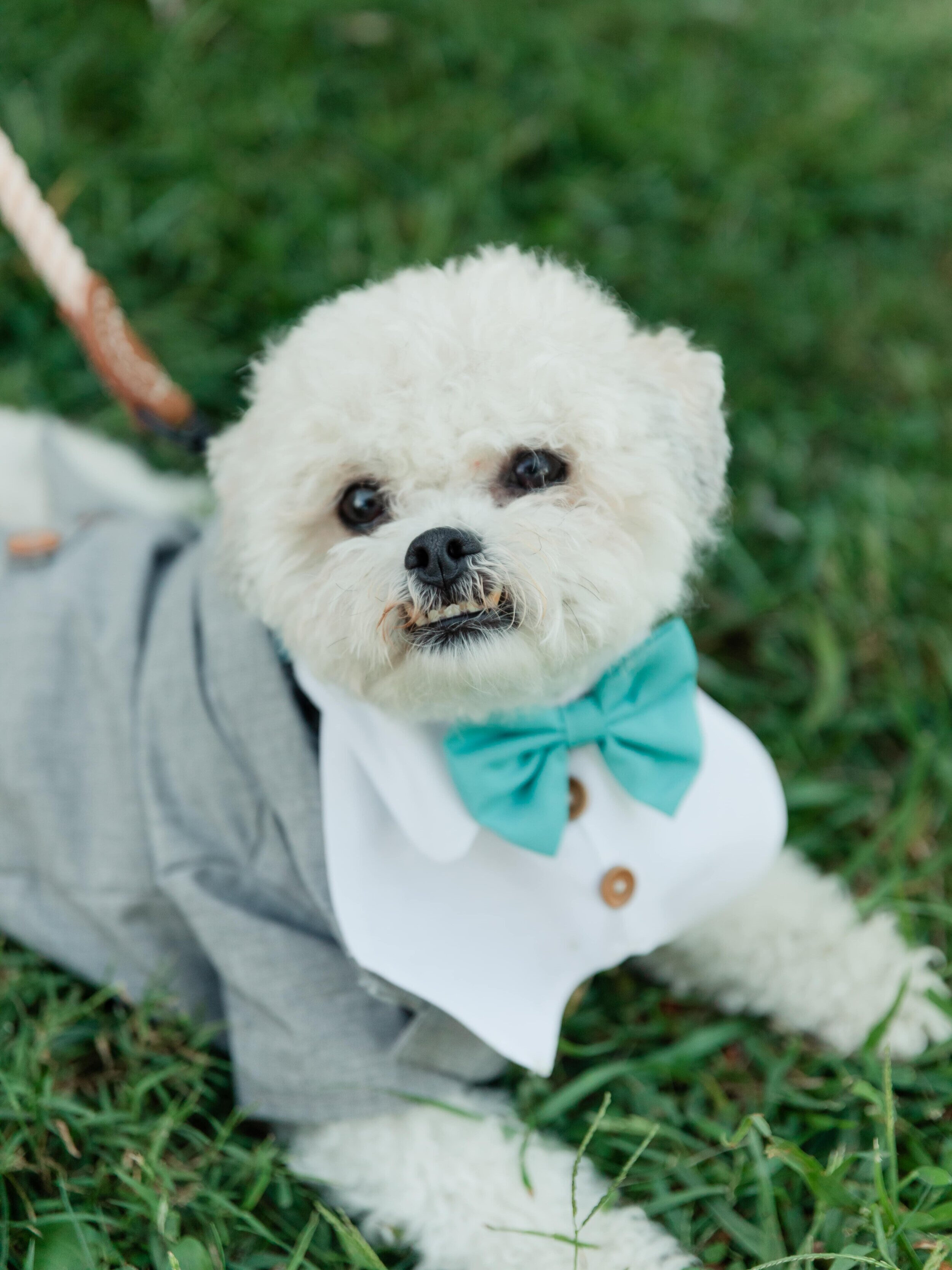
Illuminating is also about as versatile as you can get with a yellow.
It’s not really a pastel, but it’s also not a super bright or bold yellow, which allows you to pair it with more colors than its more attention grabbing yellow cousins.
This color could absolutely stand on its own as a main color in wedding party dresses, vests, ties, and the like, but my favorite place to include it as a featured color is in your florals. Yellow can be a hard color to wear for many, but flowers are going to be far enough away from your skin that they won’t make anyone appear deathly ill (like I do in yellow!). Or you can just add a few pops to Illuminate (haha - I’m so punny!) and brighten your other colors.


Other great places to incorporate Illuminating are your wedding day stationery, linens, glassware, cookie table, cake display, and other personalized details.


Over all, I think these colors are great choices, but the fact that I had so many photos to chose from among my own weddings tells me that the wedding industry is way ahead of Pantone in color selection. But, I’ve been saying that for years!
Whether you chose to use these colors in your wedding or not, let’s hope the forecasts assigned to them are more accurate than last year’s, because I don’t think anyone could say there was much consistency, stability, or connection found in 2020!
If you are a nerd like me, here are a couple of articles that have interesting further discussions about the color selection.
Pantone unveils its 2021 Color(s) of the Year: Ultimate Gray and Illuminating — CNN Style.This one has a really interesting section about the psychology of selecting a color each year. Definitely worth a read if you like knowing the deeper meaning behind things.
Pantone Picks Two Colors of the Year for 2021—The New York Times A fun tongue in cheek, sarcastic exploration of why these colors are perfect for right now.