New year, new Pantone color
And by new, I mean REALLY new. For the first time in its 20+ year history, the Pantone Color Institute has created a new color for a year - Veri Peri. (Although it seems similar to 2016’s Serenity to me - just a bit darker and more saturated.) While last year’s colors focused on optimism and resilience, Veri Peri uses color psychology to combine blue - representing calm, serenity, tradition, and trust - with violet red undertones bringing energy, determination, passion, and daring to the party as well. It sounds like just what we need after the last two years.
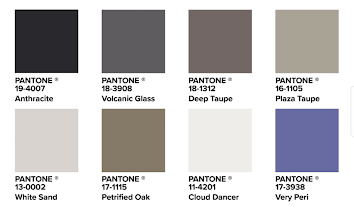
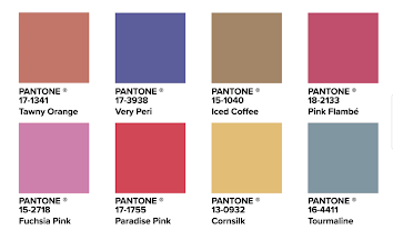
“...Very Peri brings a novel perspective and vision of the trusted and beloved blue color family, encompassing the qualities of the blues, yet at the same time with its violet red undertone, PANTONE 17-3938 Very Peri displays a spritely, joyous attitude that encourages courageous creativity and imaginative expressions. ”
How to Use Veri Peri in Your Wedding
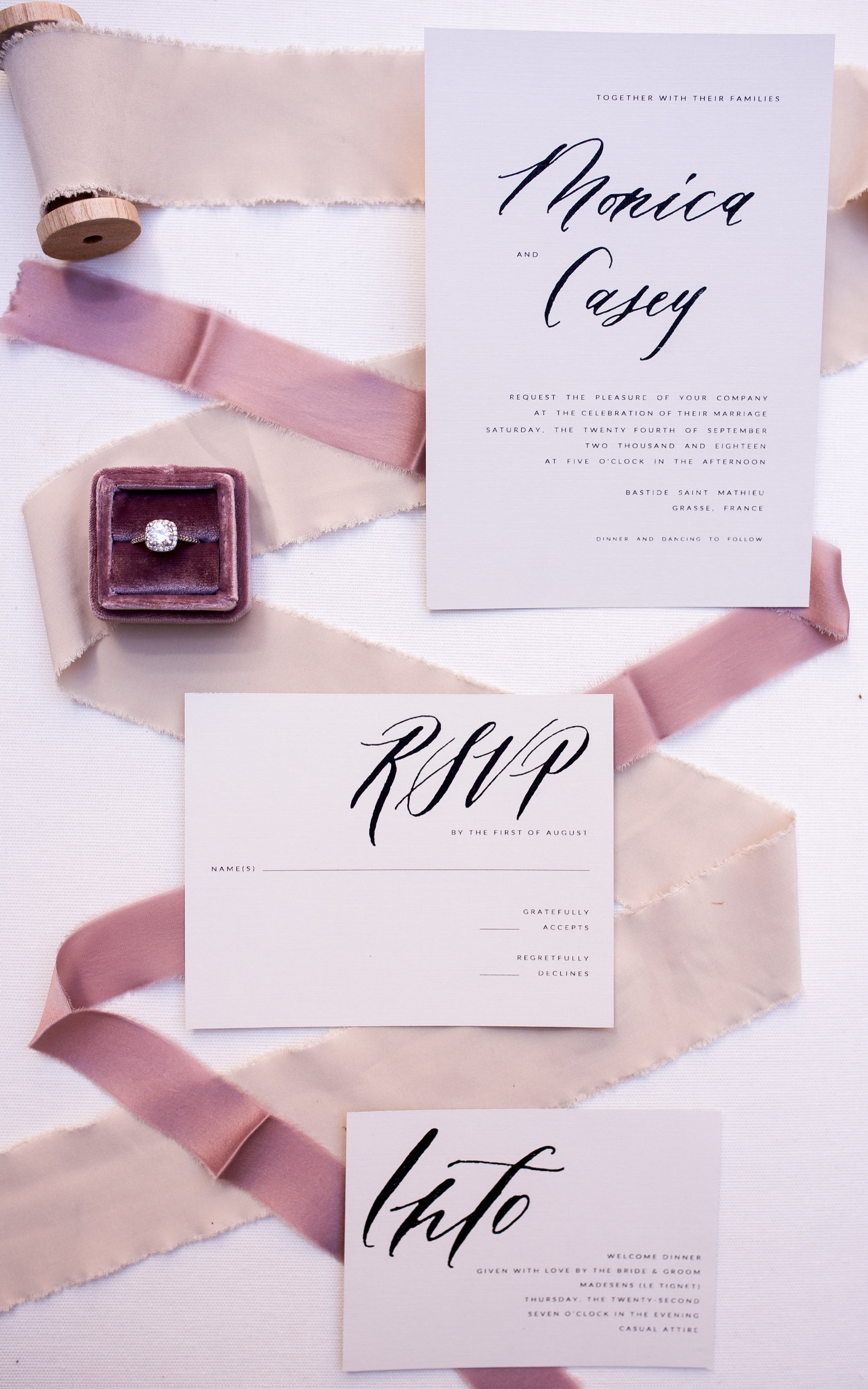
According to Pantone, Veri Peri promises “to bring joy as the 'happiest and warmest of all the blue hues,” and who doesn’t want that at their wedding? I actually like this color, as I haven’t seen too much of it here in Pittsburgh, but it can be a hard color to use in a wedding. While some might choose to use this a the main color in their wedding palette, most will chose to use it as an accent. What you pair it with will dramatically alter the way it looks and feels in the overall design. The trick, I think, is finding the right color palette to pair with this very specific, quietly bold tone.
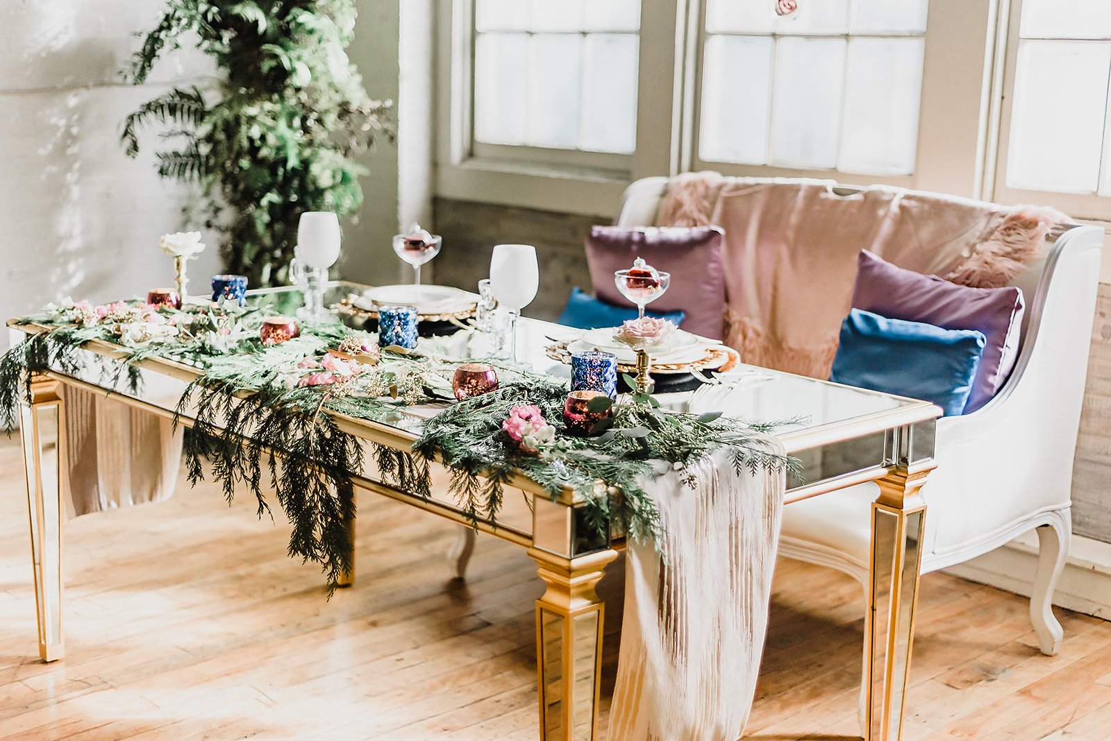
*Most of the photos that follow aren’t exactly Veri Peri, since it’s a new color, but they’re close enough to give you an idea how you could use a periwinkle shade like Veri Peri in your wedding design.
Metalics
One of the most versatile things about Veri Peri is that because of its balance of warm and cool tones, it will pair equally well with golds, silvers, or other metallics, in either shiny or brushed forms.
Muted Earthy and Jewel Tones
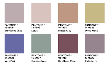
Veri Peri looks great with earthy and jewel tones (hello color wheel theory) in their natural state, but what really puts it over the edge and makes it look modern and sophisticated is using a muted version of these hues. I’m normally a full saturation gal, but I’m loving the richness of this periwinkle with the balance of still rich but less vibrant tones.
Neutrals
If you want your Veri Peri to stand out, neutrals are the way to go with your palette. Metallics, like we saw above, are one way to do this, but you can also go with non-metallic neutrals will also look lovely. Don’t forget, lighter (or darker) hues from the same base colors totally count as nuetrals - in this case, other pinks, blues, and purples.
Brights
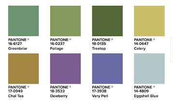
The boldest way to use Veri Peri is to use it with other bright, vibrant colors. It’s perfect for a classic spring or summer garden or garden party wedding, but it could also make for a wonderful eclectic, boho style wedding.
What do you think — Love the color? Hate it? Apathetic about it? Don’t know why anyone cares what Pantone thinks anyway? Hit the comment button and let me know. And if you aren’t a fan of Veri Peri, stay tuned! I’ll be sharing some other color experts’ picks for colors of the year soon.
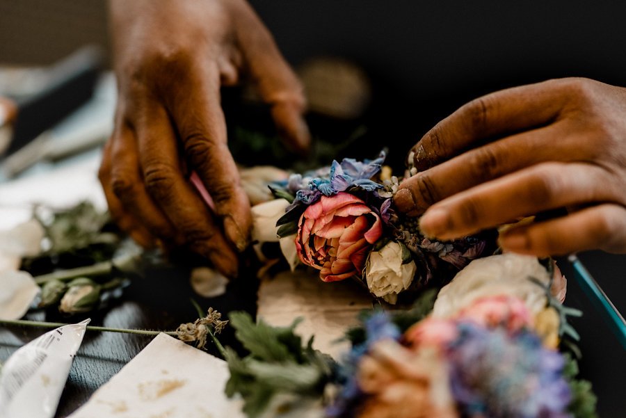
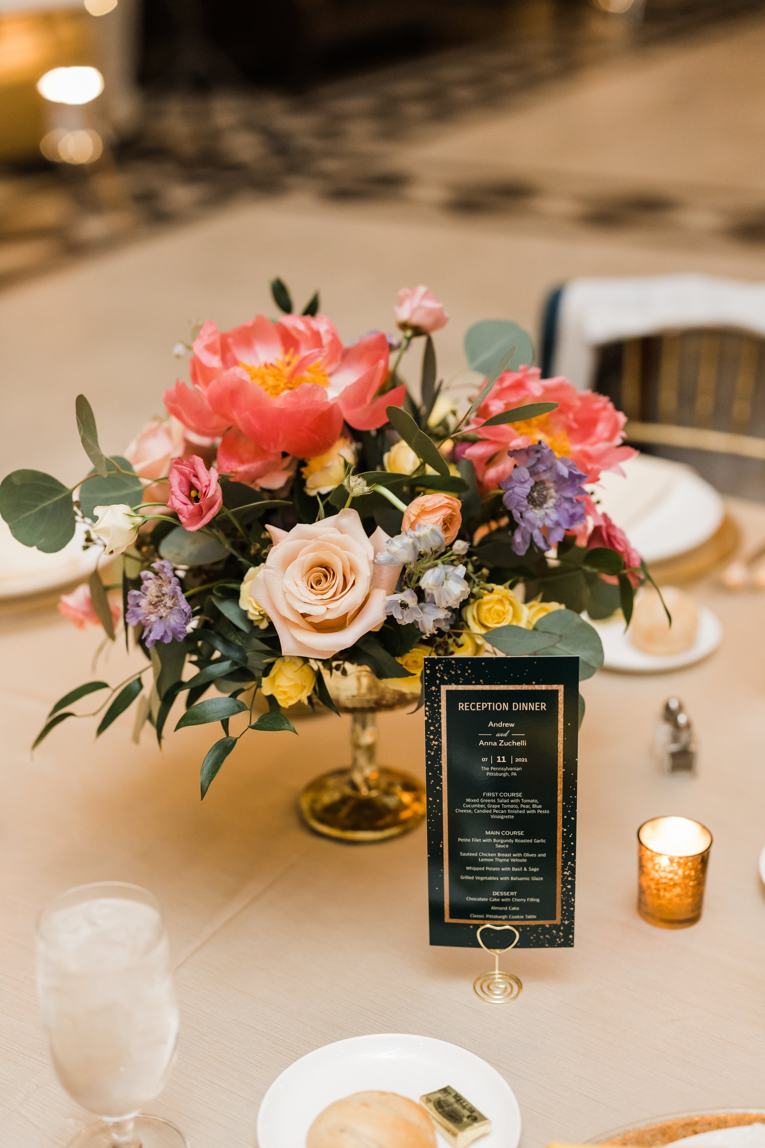
Title image photo by Steven Dray Photography, flowers by Community Flower Shop.
Thanks to Build.com for the color swatch images.


